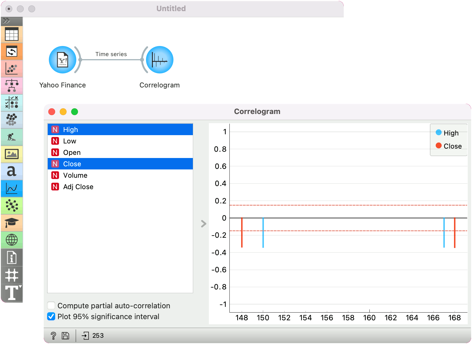
Correlogram
Visualize variables' auto-correlation.
Inputs
- Time series: Time series as output by As Timeseries widget.
In this widget, you can visualize the autocorrelation coefficients for the selected time series.
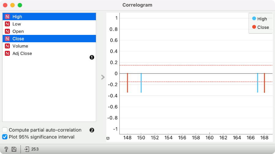
- Select the series to calculate autocorrelation for.
- Choose to calculate the coefficients using partial autocorrelation function (PACF) instead. Choose to plot the 95% significance interval (dotted horizontal line). Coefficients that are outside of this interval might be significant.
Example
Here is a simple example on how to use the Periodogram widget. We have passed the Yahoo Finance data to the widget and plotted the autocorrelation of Amazon stocks for the past 6 years.